Developer Hub @ Citi
Citi APIs enable 3rd parties, who can contract with us and become Partners, to have their applications registered in the production environment of our developer hub.
My role
UX designer
Duration
12 months
Time
2018 - 2019
Platform
Web browser

I was involved in the design process as an UX designer back in 2017. The portal was built as a marketing platform which provides API catalog, documentation, FAQs, Developer Service channels to allow partners to access Citi’s and Citi Customer’s data directly.
As the purpose of the Developer Portal has been evolving from a marketing channel to an assessment tool. Together with the unguided growing content, the platform requires a design consultant in 2018 Q4. I started auditing user-experience of the entire website and re-built the site architecture which includes navigation, sequence and content of pages. In this project, I focused on product-focused research and analysis helped achieve the primary business goals as well as balance user needs of various tasks.
Following, I will explain in depth of how we identify the project scope and goals, the process of IA redesign and the implantation for API Catalog page.
Deliverables
Concept development
Wireframes
User research
Information architecture
What is API?
APIs (Application Programming Interface) are a system of subroutine definitions, protocols, and tools for building application software.

Citi APIs enable 3rd parties, who can contract with us and become Partners, to have their applications registered in the production environment of our developer hub. With proper authorization depending on the API types and nature of the application, Partners are able to connect and access data directly from Citibank.
Background
Target customer
Who use our API?
We have identified personas and designed a responsive browser experience to fulfill the need for customer to explore our API product and for Citi to market our services.

Project goal
Problems
Based on the business roadmaps, the purpose of the Developer Portal has been evolving from a marketing channel to an assessment tool, now towards environment needed for testing, gaining access to Swagger files and logging all the work a development teams carries out in moving towards Production.
Therefore we see clear opportunities to shift our narrative in a way that serves our business and improves customer perceptions start with rethink the site structure, redefine the goal and hierarchy for each pages today at our Dev Hub Portal that meets our new program goals.
The current architecture failed to lead the right persona to the ideal page and causing high call volume.
Inconsistent visual components and interaction.
Many pages are lack of information hierarchy due to rapid development.
Due to product direction shift, it is challenging to define the redesign project scope and focus.
Research
- interview
Remote discovery interview
For this round of end-to-end user testing, we have tested 10 customers, including members from our current partnerships, Intuit and Xero. The method is remote user testing, with 90 minutes session each, engaged with our current Dev Portal given series of tasks.

Findings
It became apparent throughout the testing that although the current site has the most content they expected, however the site quickly be made redundant for our partners, this is mainly because many of content such as sand box testing and product use case was somehow hidden or not connected with API Catalogs.
“I need to know more about the APIs and documentation, but I’m a developer, so my needs are different.”
Located in
Miami
Singapore
Australia
San Francisco
Palo Alto
Ohio
Mexico City
“I want to see more examples of how your APIs power the user experience, so I can gain inspiration for my own build.”
From the conversations, many users repeatedly noticed inconsistencies in labelling, structure and categorization, which ultimately slowed down their process of finding specific information.
Research
- product audit
In order to define the project scope and potential impact on release planing, I started the process from learning what is currently out there on our site today. The goal is to identified the gaps between past launches and in future development. At the main time this study is an efficient way to learn about our content strategy, understand the page level relationships.
More in-depth, we have taken the screenshot of all current pages and labeled with target served personas. This process accelerate our communication with product team to define the scopes for each page and overall sites, which has set a good foundation to get started.

OUTCOME ONE
IA Redesign
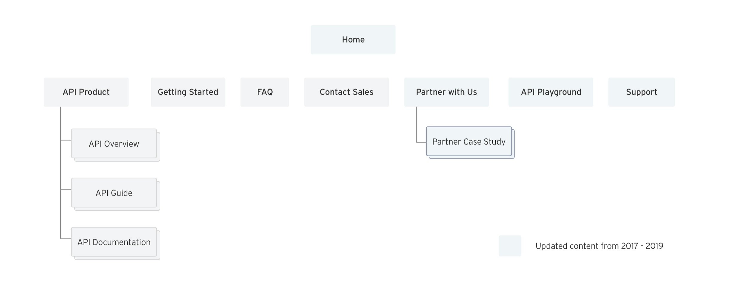
In assessing the improvements needed for the site the themes that continued to be repeated were around the user wanting to understand the capabilities of Citi’s API offering and be given an overarching process of how to engage with the site or essentially, put that offering into practice through API testing. We believe that making improvements to navigation labels, key CTAs, instructional copy and including elements of interactivity in the design will successfully bridge the gaps in the site’s flow and process.
Workshop
Since we revisited API pages (Partner with us, Case Study wires, Documentation, Keys & Playground), we identified where key information needed more prominence and where information could be shifted for clarity across pages.

Proposals
Through partnership interviews we identified opportunities to clearly delineate between Developer-centric ‘task-driven’ information from Business Development information. Thus, we made the decision to group content to better serve each segment of the personas, new IA suggestions has been created.

Concept validation
We leveraged industry standard terminology to optimize clarity and way finding for our navigation.


Solution
Enable users to get up and running to play with our APIs and make a call more quickly/easily
Clearly show case our API catalog offering and where they’re available
Consolidate the current IA and form clearer pathways for the user, such as:
Offer a clear path way to users who want to see examples of what we’ve done before, placed in the context of customer stories
Strengthen the purpose of the channels in which we want users to contact us, i.e. Tech Support vs. a partnership enquiry

Next step:
Project scoping
Planning
After the new Information Architecture was defined, as well as customer pain points was discovered, I have created the roadmap (working file) to identify the goal for each page, find the connect, track our process, record change logs. Most importantly, this file acts like reference to communicate with product owner and dev team, define project scope and consolidate the business requests.
After series of workshop and discussion, the team has prioritized design tasks based on business impact and technical feasibility.
As a team, we decided to start with API Catalog page to set foundation structure, as this holds the most entry points and need the most handholding from user testing.
Moving forward with adopting the structure to other pages.

OUTCOME TWO
API Catalog
Ideation:
Wire-framing
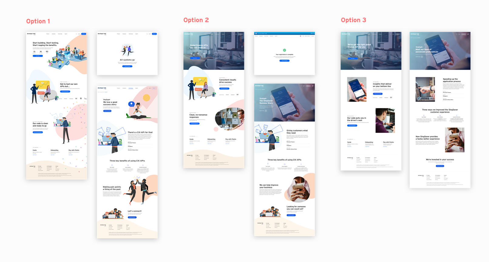
Global variation
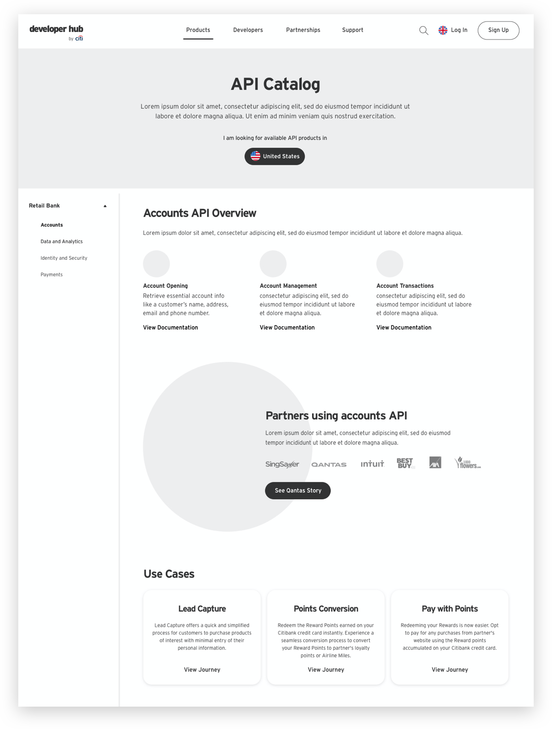
Option 1 allows customer to view all API category and product at a glance, however this would also highly depends on categorization strategy.
With option 2 , customer can view details without preselect any options, which could avoid lack of contents and also more adaptable with growing API.
Compared the pros and cons for each option, the main goal is to allow customer to navigate and preview what we offer instead of the list of products, along with dependency consideration, the team decided to move forward to left navigation option.
AU Consumer Data Right
Background
The Products Catalog Page was the one that most users needed further explanation on from previous testing. Overall it didn’t act as a navigational blocker, but raised questions about the offering and slowed the user down when navigating to other pages. Some users were only concerned with their own region, whereas a smaller number were considering the deployment across multiple regions where their customers were located.

Business goal
API Catalog showcases Citi’s API products, capabilities, availability. Aimed to allow business partner to explore the breadth, depth, relevance (use case) and location of our product offering. As the product growth, we are aim to serve BasS (white label business) in 2020. Therefore, after discussion with product team, we would like to introduce the New Categorization Approach for Dev Hub API Catalogue, Documentation page, with a consolidated Playground experience.
Accommodate BaaS APIs going live to the public
Alignment of more APIs from Asia & PSD2 Grouping APIs according to a category reflecting the service they deliver
Renaming certain APIs to better reflect the functionality they enable
User needs
Easy to locate information about our API products, capabilities, availability by geolocation. Introduce entry point to use cases and documentations better assist the needs for both target user, the business leads and tech team.
Design iteration
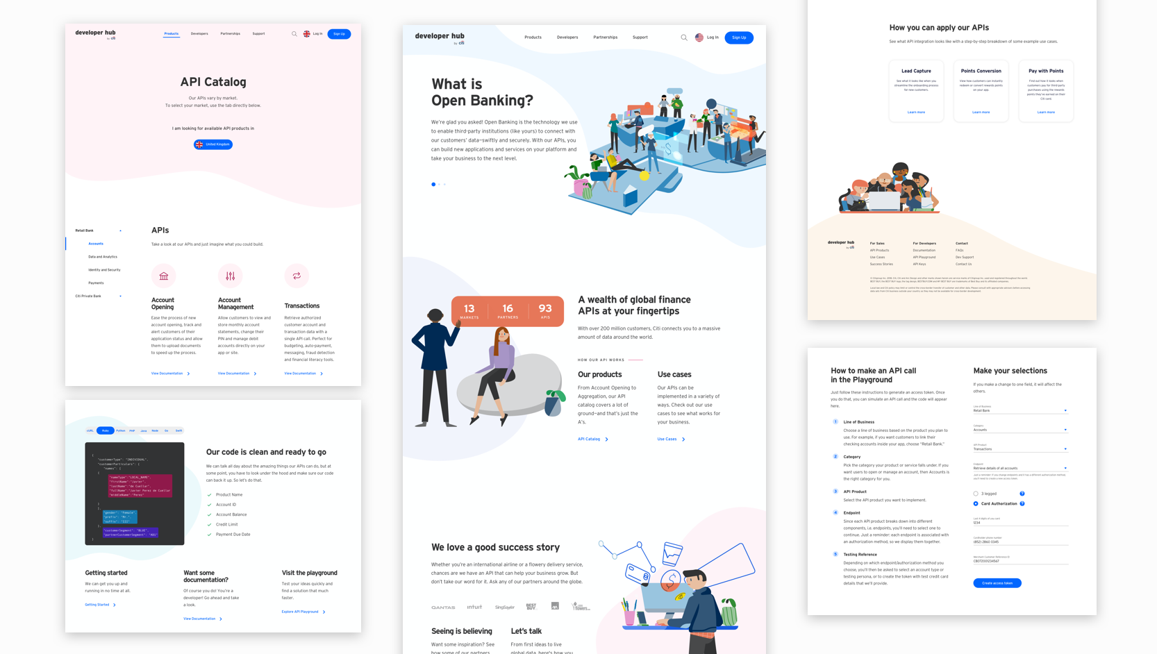
The initial design is focused on setting up the content hierarchy for categorization and enable navigations.

Customer could replace tile filters with a table view of market availability, as from research interview, customer would less often to explore product by various location.
By category allow customer to view lists of product and rich content per API citi offers.
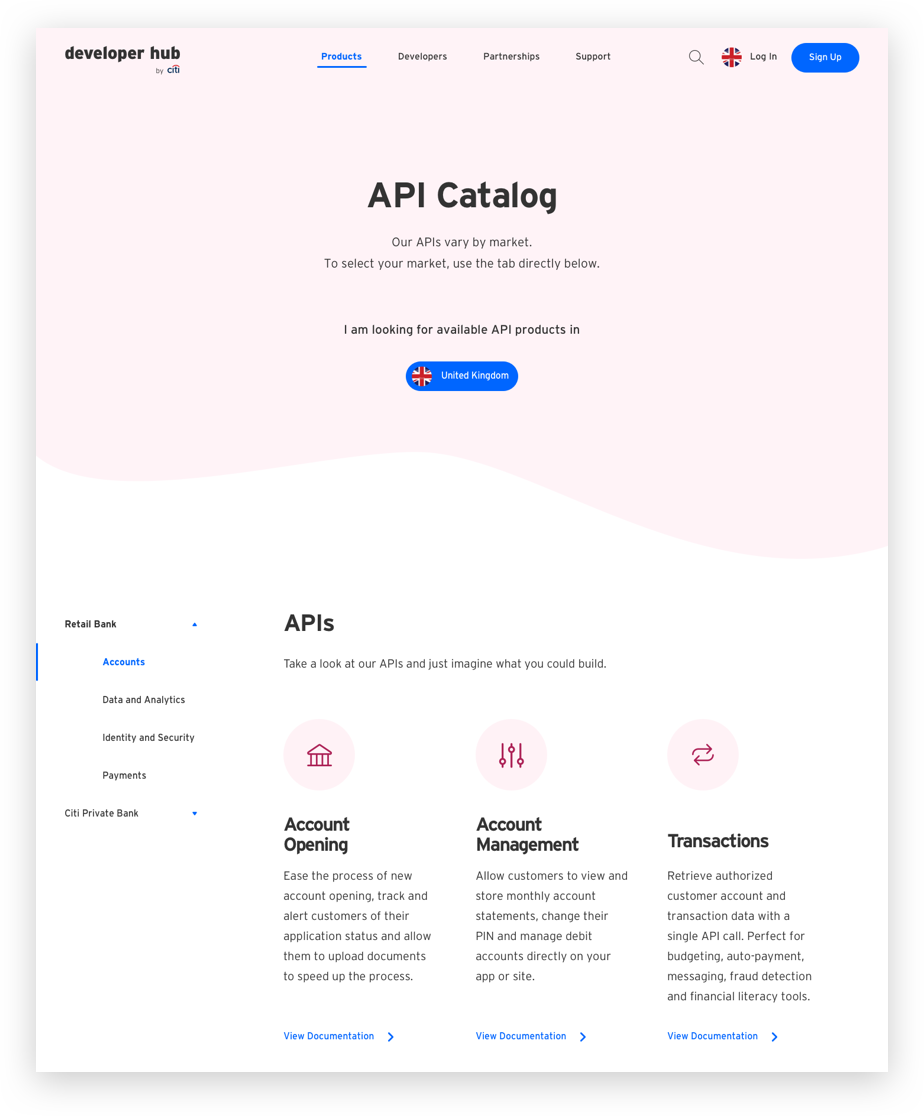
By Line of business allow customer better navigate with an additional level up based on region offerings, such as PSD2 and Investment banking vs. commercial.
Content hierarchy variation has been presented to stakeholders with consolidated feedback that “Line of Business” model could eliminates content creation from Citi sides per product and also would more likely to scale with region expansion. Decision is moving forward with the option adopting “line of business”.
Solutions
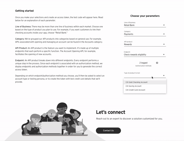
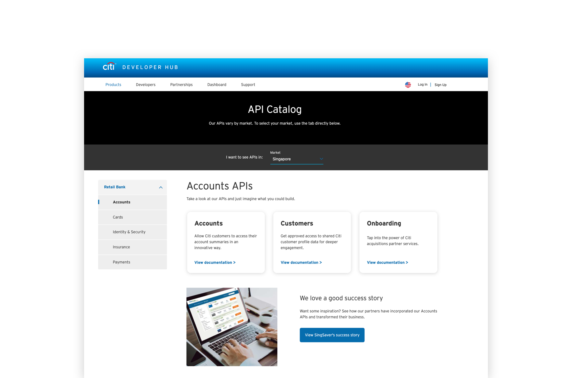
The API Catalog page solutions allow customer to navigate product business line and category from left navigation and view available product list, success stories and in-depth use cases at a glance with all major navigation on one page without navigate in and out from multiple pages.
Market selection
Default customer to their local market region


API product list
Introduce our product with a little more information and link to the Documentation detail for customer to dive deep into the technical terms.

Constrains
Apart from the challenge for categorization hierarchy, governance constrains and technical limitation are the other major fact we have to consider when implementing the design solution. Conversation and work sections have been conducted with our product team in Europe and UK for PSD2 regulatory, and with the Australia team to define structure of customer data regulations.

UK Private Banking

OUTCOME THREE
Ecosystem adoption
Testing
The impact
After we have launched the New API Categorization Approach, the logic has been implemented through the site with multiple journeys. Therefore, design with a scaleable strategy plays an important role when the project might shift the ecosystem.
API documentation

API playground
Usability
A unmoderated interviews for site usability has been conducted with our strategy team and third testing party C-Space. Testing goal is to gather in-depth feedback about API Catalog, Documentations and API Playground pages. Confirm extent to which design enables a smooth and intuitive customer experience, and identify any pain points or areas of confusion
Audience is a mix of global developers and relationship managers from the US, UK and APAC. They were asked to explore the pages and provide overall feedback, locate APIs for different global regions (U.S. and Hong Kong) and complete discrete tasks.
Findings
Overall, users understood the purpose of the playground but struggled to complete some select tasks.
Generally speaking the landing page was regarded as clear and straightforward
Labelling and nomenclature was clear and easily understood
Some suggested a tutorial in the upfront in order to support clarity and executing API testing for sandboxes playground
Content strategy
Visuals
Tone of Voice
Our strategy team have helped us recruited in total 78 candidates, including business developers, relationship managers and engineers from EMEA, APAC and NAM for a customer insights survey, Aim to Deep Dive on brand character territories and preferred design elements, which will help us determine how well each fit the brand when move forward to visual explorations.
Findings
Each option was positively received, but do not ladder strongly to our desired associations. Therefore, we decided move forward with option 1, since illustration share less limitation for governance, and it shared more flexibility compare to stock images.

Interface exploration
Worked closely with the visual team exploring how might we adopt the new design system to make our Developer portal more vivid as a truly playground.
In production
Takeaways
We have launched the new IA in Q4 2019, content under navigation “Product” and “Developer” are mostly in production in Q2 2020. Due to project scope, the redesign of Dev Hub is built with current design system.
As this is an ongoing project, we will continue visiting content regarding to “Partnership” stories with the content strategy team and execute on the re-skin to adopt new visual language.
From this project, I have learned asking the right questions to understand the true problems is critical before landing on a good design solution. As the lead designer for this team, it is challenge at first to work a project that you don’t have much knowledge of, therefore, communicate with visual mock ups to the disciplinary team could accelerate the decision making process and reduce misunderstanding. Also, active listening, contributing, taking ownership, and collaborating wisely are the needed elements to ensure project success.