Document Center
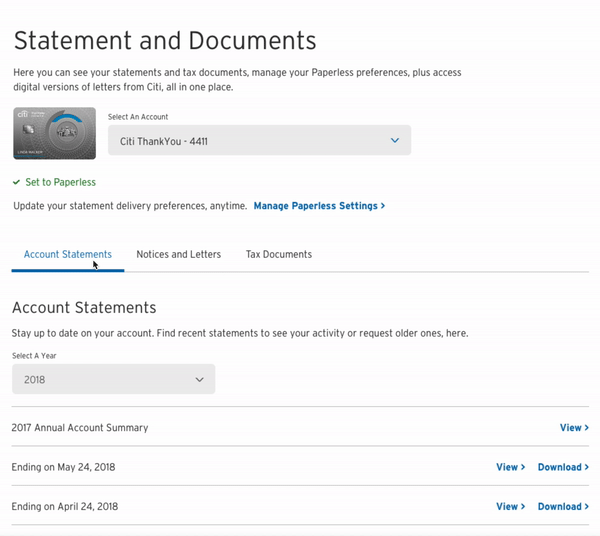
Statement and Documenter Center is the place for Citi customer to access their digital versions of statement, notice letter and tax document, they could also manage Paperless preferences here.
My role
UX designer
Duration
6 months
Time
2019
Platform
Responsive web. iOS. Android

Background
Citi is working to enhance document digital experiences, make changes to the paper statement, as well as develop communication strategies to encourage customers to opt out of paper and go digital. After the design enhancement for paperless enroll experience, our team has proposed to rethink the structure for our current digital document center.
From the paperless enrollment case study, we have learned our business KPI is to raise the number for paperless customer. However, behind the enrollment behavior, we have to face the bigger problem, our digital document delivery platform.
“A unified platform for electronic communication can certainly give banks more consistency, but a bigger problem is consumers’ general lack of trust in electronic statements. That can only be alleviated by giving them a deep archive and assurances about access.”
Project Overview
Project Goal
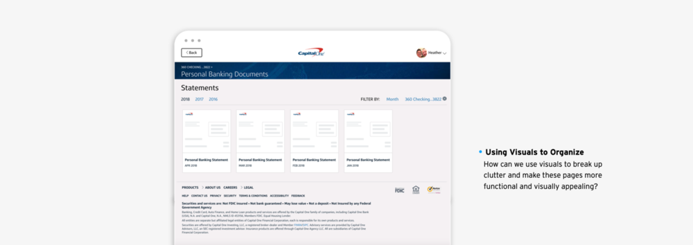
After research and discussion, we want to redesign our statement and document platform. Bring a number of different pages like Account Statements, E-Communications, Tax Documents (MRC and Bank only), Secure Message Center and Manage Paperless Settings all together into a single Document Center “hub”, ensuring users that their documents of all types will be easily available to them. This will help resolve issues around find-ability and consolidate different pages into one experience.

Customer need
Feel confident and reassured that documents will be assessable when they need them.
Design approach
Communicate superior security, availability, and accessibility of documents to create an enhanced digital statement experience.
Business goal
Increase Paperless adoption and retention as well as customer satisfaction (NPS).
Decreased calls around Document Center topics.
Experience Audit
What we could learn from the current journey
I led the design team from experience, visual and copy perspective to review our current document center and define the opportunity through two weeks design sprint. The major goal is:
To level set on current customers’ experiences
To use our SME capabilities to identify high points of leverage
To identify key questions we want to bring to our customer interview

Findings
Through the audit, we have learned Statement and Document Communications Center are confusing and unfamiliar to participants from all internal teams. We have the opportunity to enhance the existing structure, and ultimately consolidate all communications in the same location and categorize them by content, rather than format.
Competitors
Analysis Approach
The approach is to find examples of Document Centers, statements, tax forms, etc. from main bank competitors, fin-tech and aspirational competitors. Identify trends, key features, styles, etc. that we want to explore in concepts. Decide on next steps together to begin wires.
Direct Competitor - Major Banks
We have looked the major banks in U.S. and globally.
Having one main area to be able to view all different types of documents is a preferred customer experience. There is less clicking around and shows users what is available from the outset.
Visualizations of documents can act as a “View” CTA, allowing for more clear “Download” and “Print” CTAs to live separately and be more clear to users.
There were no other real examples of Secure Messaging within the documents area. It tends to be in Contact Us, communications, or as an inbox.

Indirect Competitor - Fintech & Aspirational
We have learned the experience from investment, payment, tax and other inspiring platform.
Turbotax provides different ways to access, giving flexibility to the user, while others keep it very simple and straightforward with clean UI.
Marcus’ minimalist UI and conversational approach is a rapid departure from other banks, highlighting to the user exactly what they need with nothing extra.
Wealthfront’s tables are clean and clear UI and labeling. It is clear to users what kind of documents are available and how they will be downloaded.


Challenge
Create information hierarchy for customers to select the type of document and account
Define the site structure to combine each individual page into a consistent architecture
Communicate with product owner to move security messaging center to messaging journey
Apply clean label and visual hierarchy through the experience
Ideation
The ideal experience should be centralized, intuitively organized, and easily accessible from multiple platforms.
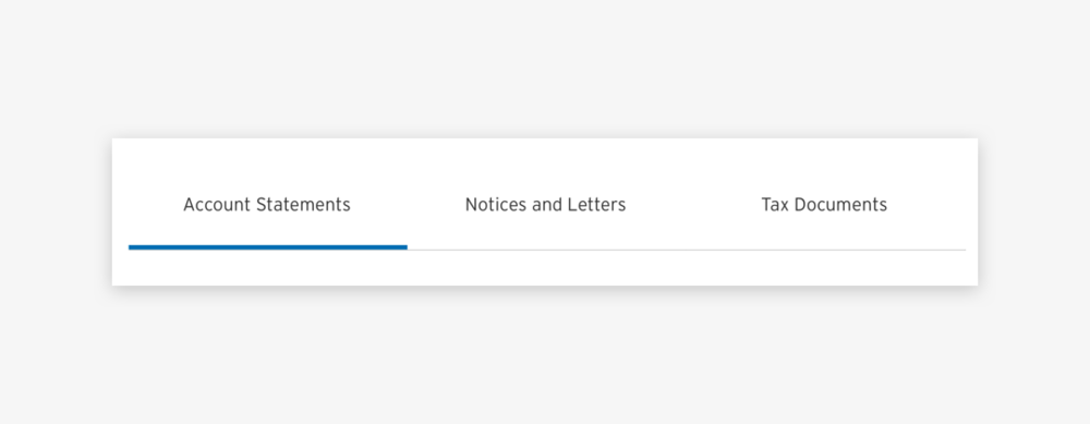
The concept of ‘hub’ combines favorable elements of the Statement and Communications Center with participants’ personal preference for categorization by content, rather than format.

From logic perspective, there’s two main ways to organize access to statements and documents: either choose account then see related documents vs. choose the document type first then chose account (some do both, giving flexibility and the choice to the user).

A/B Testing
Methodology
17 participants were recruited in total for two locations NYC and Chicago. Testing was conducted in person with 1-hour interviews were performed.
• Respondents interacted with prototypes using InVision
• Two versions of the Statements and Documents center
• Order of stimulus was rotated to avoid bias

Findings
A version
Users were able to quickly find what they needed, Users found the name of the section to be appropriate and close to what they would look for when seeking statements and other account-related materials. Respondents were able to guess what they would find within the section.
“Tab version by type of documents was straightforward and easier to navigate.”
B version
Dashboard landing was often the favorite in a forced-choice scenario.
However, respondents would have preferred it as an inclusive page, rather than as an interstitial, which is how it was perceived. Respondents described the page as clean and modern and a nice alternative to other banking pages. In particular, the banner image resonated with users.
“I wanted to be able to use the “See More” and “View” buttons to expand content on the same page.”
“I would like to access the additional documents without having to navigate to another page.”

Iteration
Apply research learning + Design and Governance review
After the A/B testing, I have learned the pros and cons from each version by reading through all the comments and final test result. Iteration of concepts are mainly to apply all learning from the test and work closely with Dev Team and Governance to identify feasibility and limitations. The feedbacks from peers helped me make small usability improvements, as well as assisted me to make major changes in my design direction.
For example, although Version B of dashboard is the most preferred version, due to back end data storage limitation, I could only adopt the look and feel, as top image banner and partial visual elements from it. Combined the Tab Navigation solution to align the preferred IA and reuse exciting code.

Usability Testing
After the entire journey was completed, both happy path and some edge cases. We have went through the final round of usability testing, using the method of recorded unmoderated user flow tasks by InVision prototypes. Overall 24 customers (MRC and Cards) were recruited and asked to achieve the designed tasks, including the journey of view account statement, download older statement in 2016, find a letter regarding to specific topic, download previous year tax document, etc.
The results shown the experience was rated within the “easy” category (88%).
Deliverables

Takeaways
Look back the overall process, the most essential agreement is to pitched the concept of redesign document platform to design team and product journey owner. With the background study for precious behavior research, current site audit and competitor analysis. Since the research, conceptual testing and usability testing was thorough and comprehensive. We have prioritized the feature, minimized development workforce and worked in-depth of design solutions.